FloorVenue
Reshaping the experience of buying flooring online
Buying flooring is complex so most people who are not trade professionals, so I joined the team to design the UX and UI FloorVenue's digital transformation that brought their in-person only sales process, online.
FloorVenue
Reshaping the experience of buying flooring online
Buying flooring is complex so most people who are not trade professionals, so I joined the team to design the UX and UI FloorVenue's digital transformation that brought their in-person only sales process, online.
FloorVenue
Reshaping the experience of buying flooring online
Buying flooring is complex so most people who are not trade professionals, so I joined the team to design the UX and UI FloorVenue's digital transformation that brought their in-person only sales process, online.
Context
FloorVenue is of one of NSW’s most established flooring retailers and installers, FloorVenue, who up till that point, had a web presence that acted only as a catalogue site – a place for customer calls and enquiry forms – but lacked any e-commerce ability.
I joined this major website redesign and migration to Shopify project as a UX and UI designer, and worked closely with the project lead who had several years of experience working with the client. Her understanding of their business and customer journey suplimented my work.
Challenge
How might we enable potential customers to find the information they need when and where they need it to?
Flooring is a complex product category, particularly for non-trades people, who were a large portion of retail customers. Our aim was to empower customers to shop with confidence, even without a salesperson by their side.
Outcome
Delivering a comprehensive design system and high fidelity dev-ready designs for an e-commerce site:
Home page
Product Category page
Product page
Product accessories flows
Product calculator and quote flows
My role
UX UI Designer
Team
Me, UX UI Designer
Penny Ou, Project Lead
Understanding the challenge
About FloorVenue
FloorVenue is one of NSW’s leading flooring and carpet retailers that offer an end-to-end solution, from wholesale and retail supply to installation. They have multiple showrooms across the state and deliver their products Australia-wide.
FloorVenue’s existing website was hosted in Wordpress and, while optimised for SEO traffic, customer feedback revealed that navigating through the site once landing in it was difficult. The existing webite also missed the oppurunity to serve customers who wanted a self-service ecommerce experience, as opposed to an in-person showroom transaction.
A multi-faceted journey
Flooring is a product category with highly technical specs, pricing that fluctuates with variables such as retail vs wholesale audiences, and a multi-touch point purchasing journey that spans in-store consultation, online product research and on-location measures for installation, depending on who the customer is.
Of FloorVenue's audience segments, we designed for the Homeowners and DIY Enthusiasts. These were the segments with the least pre-customer journey knowledge of the flooring product and installation process, and are emotionally invested in the outcome of the installation. They spend the most time online browsing between products and competitors to aid their decisions making.
Defining the problem
At four showrooms, FloorVenue was thriving and rapidly growing its physical presence, but its digital presence was lagging far behind its competitors.
Product and help information on the site was hard to find, and disjointed from FloorVenue’s fine-tuned, in-person customer experience.
Design process
Each of these pages went to this design process:
Competitor analysis for UX and UI research and analysis
Audit of current site’s page, noting what we want to keep and remove
Creating the page’s skeleton
Developing Lo-fi designed in Figjam
Iterations
Developing a Hi-fi, dev-ready page designs
Choosing a Shopify theme
A decision was made to build FloorVenue’s new ecommerce experience using Shopify for its strong foundation for creating robust, flexible and scalable ecommerce. It was a solution that could cater for the sheer volume of products and their large number of product variants.
Starting with a template in Shopify was going to be the most cost effective and efficient way forward with the time constraints we were presented with in this project. It gave our developers a base to start with, with back-end functionality and some advanced interactions already set up, whilst still leaving style and page structure to our discretion.
We chose the theme "Hyper" based on the features available, the scale of the catalogue it was built for and what micro interactions it had which we could spring-board off of.
Making this decision along side our UX and low fidelity design process allowed both the themes and our designs to inform in each other.
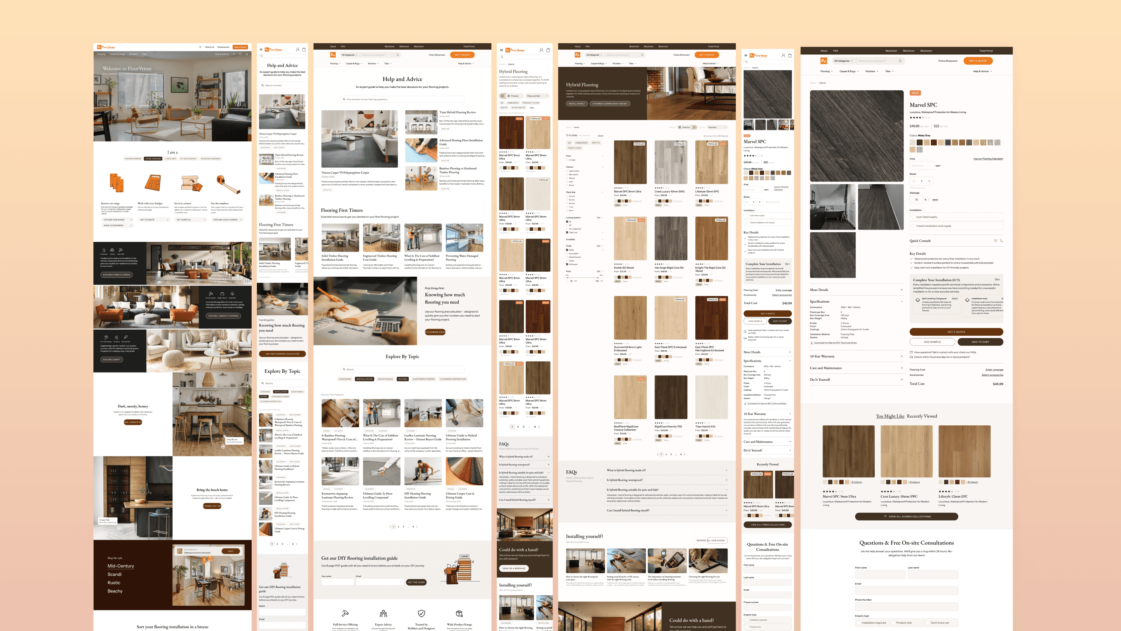
Redesigning the shopping experience
01
Home page
The original Home page was generic and designed with little thought in its visual or written content to connect with its target audiences. Products and services displayed in dictionary-style lists were evidence of a purely functionality-focused site, neglecting the power of emotive methods of appealing to customers and their specific desires.
Our redesign created a clearer, more welcoming and user-specific experience — building trust and guiding visitors toward action.
Design choices
Audience Tailoring
A dynamic “I am a…” selector allows users to identify as a homeowner, tradie, or landlord, changing the displayed content tailored to their needs and increasing relevance across audience segments.
Visual Storytelling
Large lifestyle imagery and curated product showcases replace description-less product buttons, positioning FloorVenue as a stylish, trustworthy partner.
Selling the Experience
An illustrated section breaking down the process of buying and installing flooring into three simple steps: demystifying the complex, jargon-heavy experience of researching flooring types and processes, and spelling it out in easy, digestible pieces.

Original website
Lofi wireframe
Hifi mockup
02
Product categories page
Product Category pages most commonly display products in a paginated gallery with product filtering and sorting capabilities. This was a far cry from where FloorVenue was starting. Its product category pages displayed a full-width block for each product collection (i.e. product and its variants). Without pagination, this page scrolled seemingly endlessly through the tens of product collections.
These pages are a critical step in the customer journey, where users begin narrowing down their options and seriously consider a purchase. We wanted to boost the efficiency of this shopping experience, empowering potential customers with familiar UI patterns.
Design changes
Detailed Filtering
The new filtering functionality is designed to help shoppers to browse efficiently through products based on their project criteria and personal taste, with control over categories from price range, style options, and technical specifications that affect installation and functionality.
Flexible Browsing Options
Introduced the ability to browse, sort and filter all product colour variants at once, in "Shop by Product", or “Shop by Collection” to browse variant groups by technical specs depending on what matters most to the shopper - which can vary depending on their project and demographic (e.g. a homeowner with a flexible budget looking for a specidic shade of brown, V.S. a commercial propery landlord who is after something water resistant and durable).
Support Content for DIY-ers
A “Installing it yourself?” section reassures and equips customers who aren't seeking installation services with their purchase with essential information and useful tips to support the success of their new flooring project, acknowledging the needs of budget-conscious and hands-on renovators.
Original website
Lofi design

Hifi design
03
Blogs page
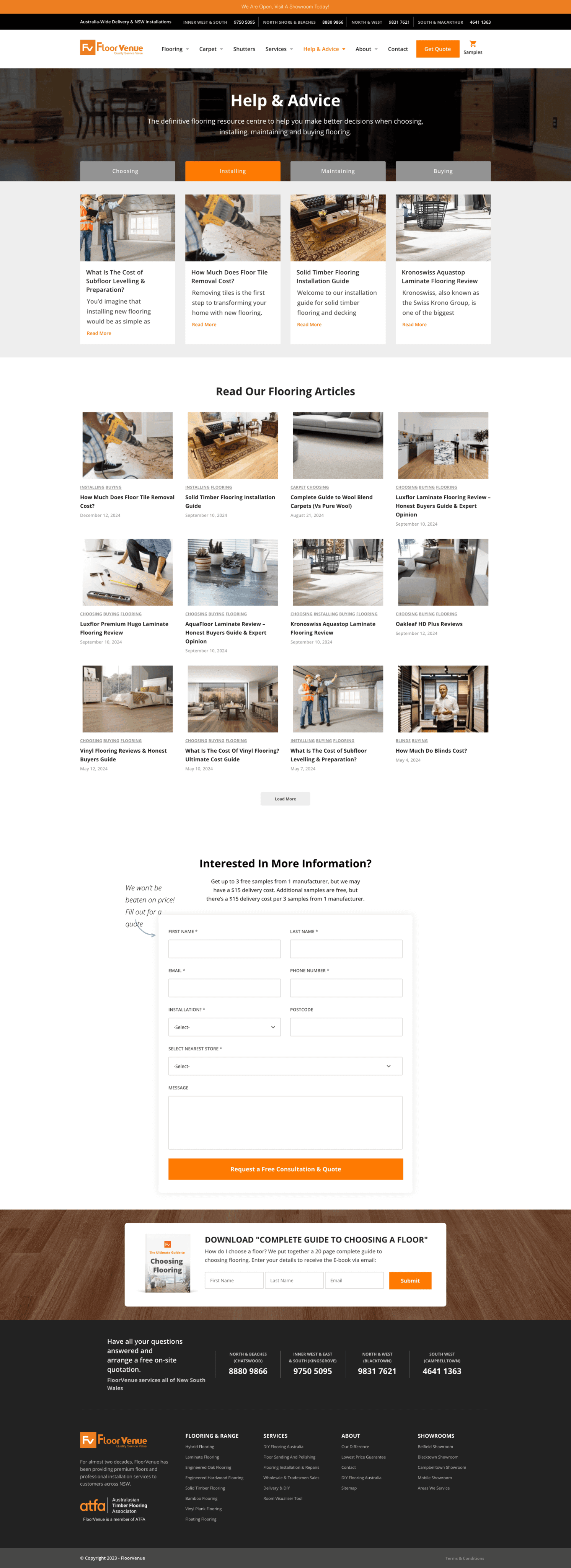
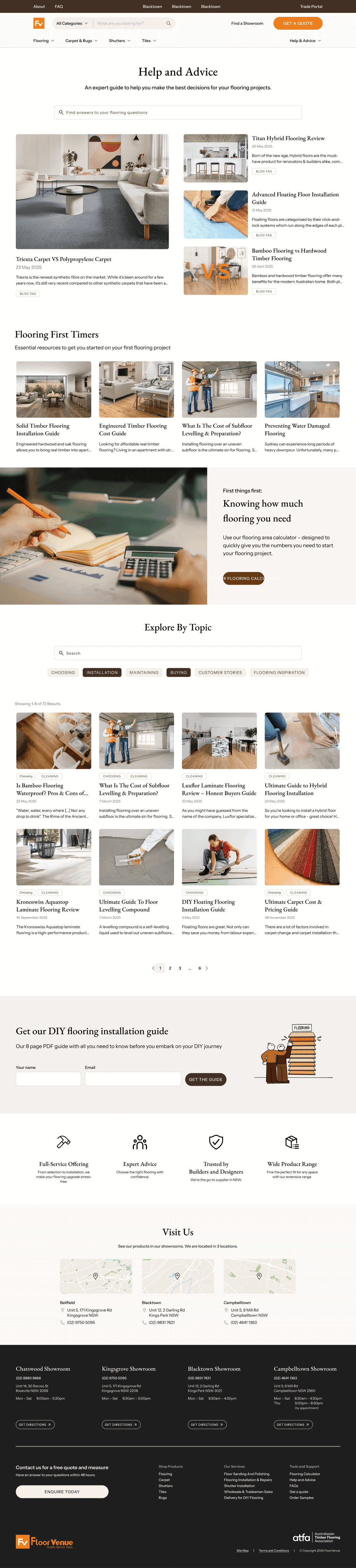
FloorVenue's blog page has a lot of SEO value: many site visitors come from the Blog page after their search engine lands them in a FV article that answers their flooring queries.
Traditionally a blog displays its articles sorted by most recently published, but that did not mean is was the most usable way to present a blog. FloorVenue’s existing blog was already rich with resources, though it trapped them in an un-searchable, un-filterable, tedious to navigate page.
Our goal was to transform the blog into a go-to resource hub that reflects FloorVenue’s expert authority while helping users find the best answers to their flooring questions quickly.
Purpose-Led Article Grouping
Instead of a traditional reverse-chronological list, articles are grouped by relevant themes and user needs (e.g. “Renovating on a Budget”). Presenting curated content collections aim to reflect expertise and anticipate user intent.
Encouraging Both Exploration and Search
The page opens with “Featured” and “Recently Published” sections to showcase timely, high-value content. For users with specific queries, a searchable and filterable article gallery further down supports browsing by category, product type, or flooring need.
Extending Their Journey Beyond Reading
Beyond written content, FloorVenue prides themselves in their support through their in-person showroom experience and digital tools like their flooring calculator. By featuring these resources adds real customer value and aims to distinguish FloorVenue from competitors.
Original website

Lofi design
Hifi design
Redesigning the shopping experience
01
Home page
The original Home page was generic and designed with little thought in its visual or written content to connect with its target audiences. Products and services displayed in dictionary-style lists were evidence of a purely functionality-focused site, neglecting the power of emotive methods of appealing to customers and their specific desires.
Our redesign created a clearer, more welcoming and user-specific experience — building trust and guiding visitors toward action.
Design choices
Audience Tailoring
A dynamic “I am a…” selector allows users to identify as a homeowner, tradie, or landlord, changing the displayed content tailored to their needs and increasing relevance across audience segments.
Visual Storytelling
Large lifestyle imagery and curated product showcases replace description-less product buttons, positioning FloorVenue as a stylish, trustworthy partner.
Selling the Experience
An illustrated section breaking down the process of buying and installing flooring into three simple steps: demystifying the complex, jargon-heavy experience of researching flooring types and processes, and spelling it out in easy, digestible pieces.
Original website
Lofi wireframe
Hifi mockup
02
Product categories page
Product Category pages most commonly display products in a paginated gallery with product filtering and sorting capabilities. This was a far cry from where FloorVenue was starting. Its product category pages displayed a full-width block for each product collection (i.e. product and its variants). Without pagination, this page scrolled seemingly endlessly through the tens of product collections.
These pages are a critical step in the customer journey, where users begin narrowing down their options and seriously consider a purchase. We wanted to boost the efficiency of this shopping experience, empowering potential customers with familiar UI patterns.
Design changes
Detailed Filtering
The new filtering functionality is designed to help shoppers to browse efficiently through products based on their project criteria and personal taste, with control over categories from price range, style options, and technical specifications that affect installation and functionality.
Flexible Browsing Options
Introduced the ability to browse, sort and filter all product colour variants at once, in "Shop by Product", or “Shop by Collection” to browse variant groups by technical specs depending on what matters most to the shopper - which can vary depending on their project and demographic (e.g. a homeowner with a flexible budget looking for a specidic shade of brown, V.S. a commercial propery landlord who is after something water resistant and durable).
Support Content for DIY-ers
A “Installing it yourself?” section reassures and equips customers who aren't seeking installation services with their purchase with essential information and useful tips to support the success of their new flooring project, acknowledging the needs of budget-conscious and hands-on renovators.
Original website
Lofi design
Hifi design
03
Blogs page
FloorVenue's blog page has a lot of SEO value: many site visitors come from the Blog page after their search engine lands them in a FV article that answers their flooring queries.
Traditionally a blog displays its articles sorted by most recently published, but that did not mean is was the most usable way to present a blog. FloorVenue’s existing blog was already rich with resources, though it trapped them in an un-searchable, un-filterable, tedious to navigate page.
Our goal was to transform the blog into a go-to resource hub that reflects FloorVenue’s expert authority while helping users find the best answers to their flooring questions quickly.
Purpose-Led Article Grouping
Instead of a traditional reverse-chronological list, articles are grouped by relevant themes and user needs (e.g. “Renovating on a Budget”). Presenting curated content collections aim to reflect expertise and anticipate user intent.
Encouraging Both Exploration and Search
The page opens with “Featured” and “Recently Published” sections to showcase timely, high-value content. For users with specific queries, a searchable and filterable article gallery further down supports browsing by category, product type, or flooring need.
Extending Their Journey Beyond Reading
Beyond written content, FloorVenue prides themselves in their support through their in-person showroom experience and digital tools like their flooring calculator. By featuring these resources adds real customer value and aims to distinguish FloorVenue from competitors.
Original website
Lofi design
Hifi design
Redesigning lead funnels
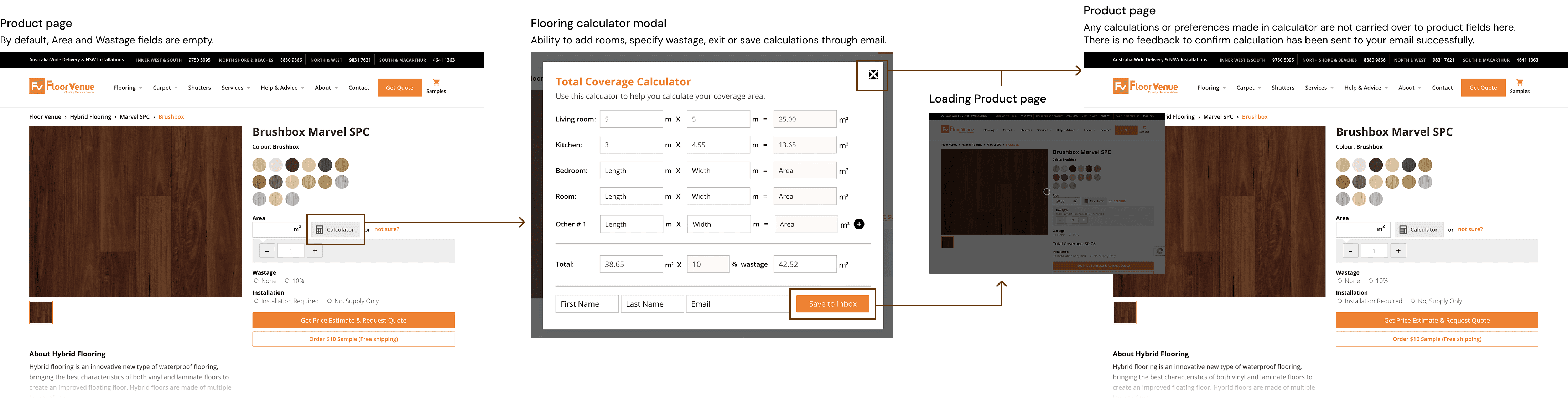
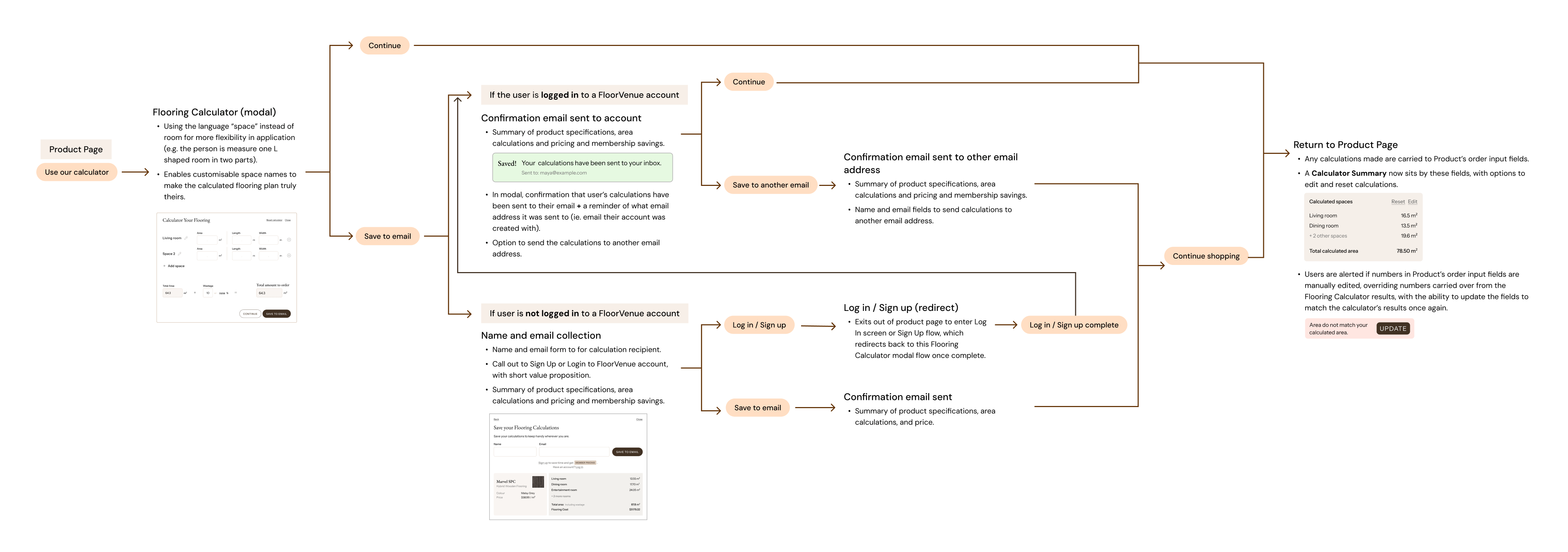
The flooring calculator
The Flooring Calculator is a tool that was designed to support residential buyers and small business owners who need a simple, accurate and convenient way to estimate how much flooring to purchase in their self-guided flooring purchasing journey. Its functionality is valuable for two key reasons:
Firstly, while using the calculator is an additional step in the product purchasing journey, in the long run it reduces purchasing friction for a smoother and more satisfied customer journey as the calculator conveniently remembers the calculations across product pages, and sends calculations to the user for safe keeping. Secondly, it acts as an email collection lead magnet.
The introduction of user accounts and membership pricing added a layer of complexity to redesigning this flow.
The original flooring calculator
The original calculator offered only basic functionality, but lacked flexibility for personalisation, it did not carry across any calculated information to other relevant parts of the site once the modal was closed, and it did not provide any feedback to users who choose to save the calculations to their email if that request was successful. It created a disjointed, disconnected experience for users.
Original flooring calculator user flow
The redesigned Flooring Calculator experience
The introduction of user accounts and membership pricing added a layer of complexity to redesigning this flow. Now account log-in status directly impacts product pricing, requiring us to design various conditional states based on whether a user is logged in while nudging users to sign up or log in throughout the experience.
Redesigned Flooring Calculator user flow
Customisable naming for real spaces
Users can now name the spaces they are calculating for (not just “Room 1”), making it easier to track multi-room calculations or measure unconventional areas.
Seamless product integration
Automatically carrying over entered values across product pages, reducing repetition and preventing user error during checkout – including total calculated area and desired wastage (the % of extra flooring ordered to cater for material that is cut and discarded in the installation process).
Email save with feedback
Improving user understanding and continuity with new confirmation indicator when calculations are successfully saved to email. Additionally, allowing logged-in users flexibility to send to their account-linked email or another email address.
Transparenct value of saving calcs to email
Showing users the value of saving their calculations to email with a summarised display of their area calculations, currently selected flooring product and its total calculated cost – information useful even in the earliest stages of research, more effectively persuading them to interact with the lead generation form.
Persistent Calculation Summary
Even when navigating between products, a floating Calculator Summary keeps calculations visible and editable, giving users clarity and control throughout their shop.
Dynamic account-aware states
Logged-in users see membership pricing in their summaries. Non-logged in users are nudged to sign up, with clear messaging about the value of doing so.
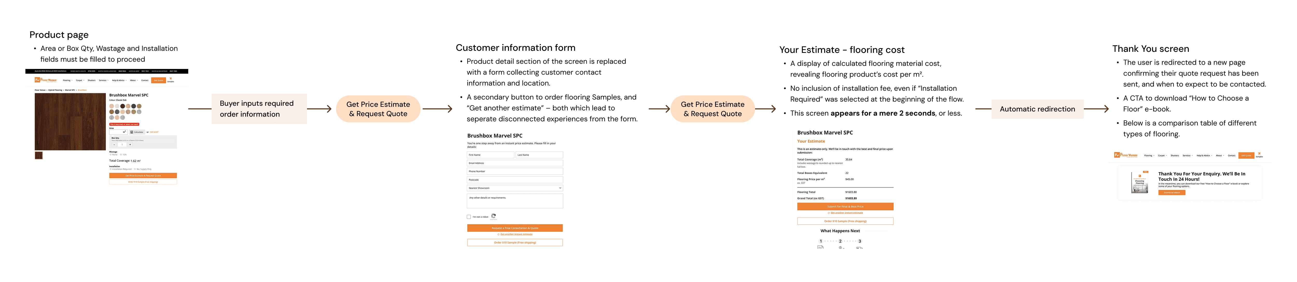
Get a quote experience
The “Get a Quote” flow is a high-intent moment in the flooring shopping journey. At this stage, shoppers usually have a solid idea of the flooring product they want, and are looking for more information on installation pricing, and any other fees involved. Their actions are guided by their intention to buy.
This flow doubles as a lead magnet, keeping installation pricing estimates behind an email collection form. Giving up their time and personal information to complete the form to find the information they are looking for is in itself, while normalised in the industry, a big ask of the user. It makes ensuring their experience of investing their time in enquiring for more purchasing information is frictionless, valuable and reassuring all the more important.
Original 'Get a quote' user flow
What was not working
The existing Get A Quote flow lacked transparency and failed to make any any attempt to form a genuine connection with the customer. Instead, it felt like a cheap email grab, perhaps leaving visitors thinking, "Did they even need my email?".
The Your Estimate page that contains a quote is negligible, as it flashes for just a few seconds after form submission before redirecting to an entirely new Thank You page, easily causing confusion.
Each stage of the quote form has multiple CTAs for unrelated services (e.g. "Order $10 Flooring Samples", "Download our eBook"), a recipe for distraction from completing the lead magnet flow and creating decision fatigue.
The redesigned Get a Quote proces

Redesigned Get a Quote user flow
Reinforced next steps
At the end of the flow, a “What’s next” section tells users exactly what to expect next (what, from who, when and why), removing ambiguity around how and when FloorVenue will follow up.
Guided multi-step flow
Pill-style pagination provides visual progress indicators, encouraging completion.
No dead ends
Clear CTAs like “Continue shopping” and “Add to cart” make it easy to return to the product page and keep the shopping experience moving forward.
Effortless account creation and log in
The quote form becomes a launchpad for account sign-up: using pre-filled contact info, users can complete sign-up with just a password, reducing friction and making registration feel like a natural step.
Recognised email addresses in the quote form trigger its own path suggesting a friendly familiarity in log in nudge.
Encouraging engagment with FV's support
An “In the mean time” section tells users how they can keep productively progressing in their flooring project, suggesting tasks that get them more involved and informed of FV’s resources and commitment to help their customers. This reduces reliance on FV team members and the likelihood of becoming impatient while waiting for call from FV team member to progress their buying journey.
Clarity, transparency, and value in quotes
While a quote estimate is emailed to the user, it also becomes immediately available to view with a clearly communicated break down of costs, installation fees, and if they are a member, their Member Pricing savings, reinforcing the value of their account with FloorVenue.
Redesigning lead funnels
The flooring calculator
The Flooring Calculator is a tool that was designed to support residential buyers and small business owners who need a simple, accurate and convenient way to estimate how much flooring to purchase in their self-guided flooring purchasing journey. Its functionality is valuable for two key reasons:
Firstly, while using the calculator is an additional step in the product purchasing journey, in the long run it reduces purchasing friction for a smoother and more satisfied customer journey as the calculator conveniently remembers the calculations across product pages, and sends calculations to the user for safe keeping. Secondly, it acts as an email collection lead magnet.
The introduction of user accounts and membership pricing added a layer of complexity to redesigning this flow.
The original flooring calculator
The original calculator offered only basic functionality, but lacked flexibility for personalisation, it did not carry across any calculated information to other relevant parts of the site once the modal was closed, and it did not provide any feedback to users who choose to save the calculations to their email if that request was successful. It created a disjointed, disconnected experience for users.
Original flooring calculator user flow
The redesigned Flooring Calculator experience
The introduction of user accounts and membership pricing added a layer of complexity to redesigning this flow. Now account log-in status directly impacts product pricing, requiring us to design various conditional states based on whether a user is logged in while nudging users to sign up or log in throughout the experience.
Redesigned Flooring Calculator user flow
Customisable naming for real spaces
Users can now name the spaces they are calculating for (not just “Room 1”), making it easier to track multi-room calculations or measure unconventional areas.
Seamless product integration
Automatically carrying over entered values across product pages, reducing repetition and preventing user error during checkout – including total calculated area and desired wastage (the % of extra flooring ordered to cater for material that is cut and discarded in the installation process).
Email save with feedback
Improving user understanding and continuity with new confirmation indicator when calculations are successfully saved to email. Additionally, allowing logged-in users flexibility to send to their account-linked email or another email address.
Transparenct value of saving calcs to email
Showing users the value of saving their calculations to email with a summarised display of their area calculations, currently selected flooring product and its total calculated cost – information useful even in the earliest stages of research, more effectively persuading them to interact with the lead generation form.
Persistent Calculation Summary
Even when navigating between products, a floating Calculator Summary keeps calculations visible and editable, giving users clarity and control throughout their shop.
Dynamic account-aware states
Logged-in users see membership pricing in their summaries. Non-logged in users are nudged to sign up, with clear messaging about the value of doing so.
Get a quote experience
The “Get a Quote” flow is a high-intent moment in the flooring shopping journey. At this stage, shoppers usually have a solid idea of the flooring product they want, and are looking for more information on installation pricing, and any other fees involved. Their actions are guided by their intention to buy.
This flow doubles as a lead magnet, keeping installation pricing estimates behind an email collection form. Giving up their time and personal information to complete the form to find the information they are looking for is in itself, while normalised in the industry, a big ask of the user. It makes ensuring their experience of investing their time in enquiring for more purchasing information is frictionless, valuable and reassuring all the more important.
Original 'Get a quote' user flow
What was not working
The existing Get A Quote flow lacked transparency and failed to make any any attempt to form a genuine connection with the customer. Instead, it felt like a cheap email grab, perhaps leaving visitors thinking, "Did they even need my email?".
The Your Estimate page that contains a quote is negligible, as it flashes for just a few seconds after form submission before redirecting to an entirely new Thank You page, easily causing confusion.
Each stage of the quote form has multiple CTAs for unrelated services (e.g. "Order $10 Flooring Samples", "Download our eBook"), a recipe for distraction from completing the lead magnet flow and creating decision fatigue.
The redesigned Get a Quote proces
Redesigned Get a Quote user flow
Reinforced next steps
At the end of the flow, a “What’s next” section tells users exactly what to expect next (what, from who, when and why), removing ambiguity around how and when FloorVenue will follow up.
Guided multi-step flow
Pill-style pagination provides visual progress indicators, encouraging completion.
No dead ends
Clear CTAs like “Continue shopping” and “Add to cart” make it easy to return to the product page and keep the shopping experience moving forward.
Effortless account creation and log in
The quote form becomes a launchpad for account sign-up: using pre-filled contact info, users can complete sign-up with just a password, reducing friction and making registration feel like a natural step.
Recognised email addresses in the quote form trigger its own path suggesting a friendly familiarity in log in nudge.
Encouraging engagment with FV's support
An “In the mean time” section tells users how they can keep productively progressing in their flooring project, suggesting tasks that get them more involved and informed of FV’s resources and commitment to help their customers. This reduces reliance on FV team members and the likelihood of becoming impatient while waiting for call from FV team member to progress their buying journey.
Clarity, transparency, and value in quotes
While a quote estimate is emailed to the user, it also becomes immediately available to view with a clearly communicated break down of costs, installation fees, and if they are a member, their Member Pricing savings, reinforcing the value of their account with FloorVenue.
Final Deliverables
What I delivered
At the conclusion of this project, we delivered a brand new website for FloorVenue's customers that provided utility with easy product and information discoverability, balanced intently with information that educated without overwhelming its audiences:
Adaptable and scalable Design System
High-fidelity, dev ready desktop and mobile designs for key pages for the website:
Home page
Product category shopping page
Product page
Product Area Calculator flow
Product Accessories flow
Get a Quote flow
Blogs page
Blog Article page
Navigation menu and Footer
Explore other work


Start a conversation
Digital & Experience Designer
GET IN TOUCH